
Revamping the Xfinity WiFi space
Timeframe: 6 months
Role: UX/UI design, eng hand-off
Impact: 95.4% call containment rate, 19.2 million monthly active sessions on the WiFi tab in the Xfinity app
🏆 Won a 2024 ClearMark Award
I was tasked with transforming the WiFi space on the Xfinity app, which gets a majority of our customers’ traffic into the app besides billing and payment. I wanted to rearchitect this page to address user needs and goals. To tackle this ambiguous task, I broke this problem into manageable bite-sized phases that could also be quickly worked on by our engineering team.
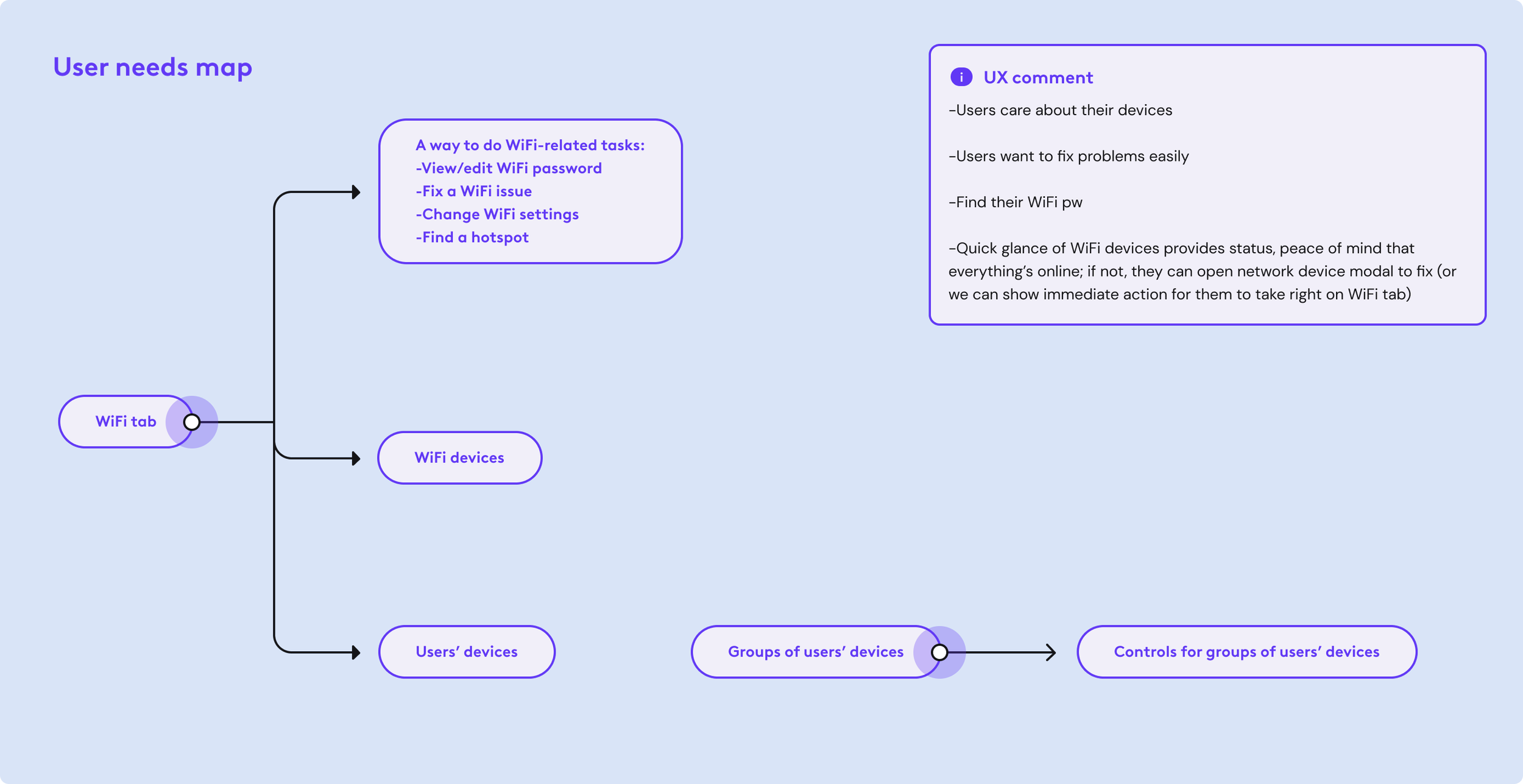
Today, the newly updated WiFi tab sees 5.09 million monthly unique household visits and 19.2 million monthly total sessions in the Xfinity app. We are generating value from this engagement as well, since there is a 95.4% call containment rate. This means that with the new updates I’ve brought to the WiFi space, a lot less customers are calling Xfinity, which saves Comcast money.
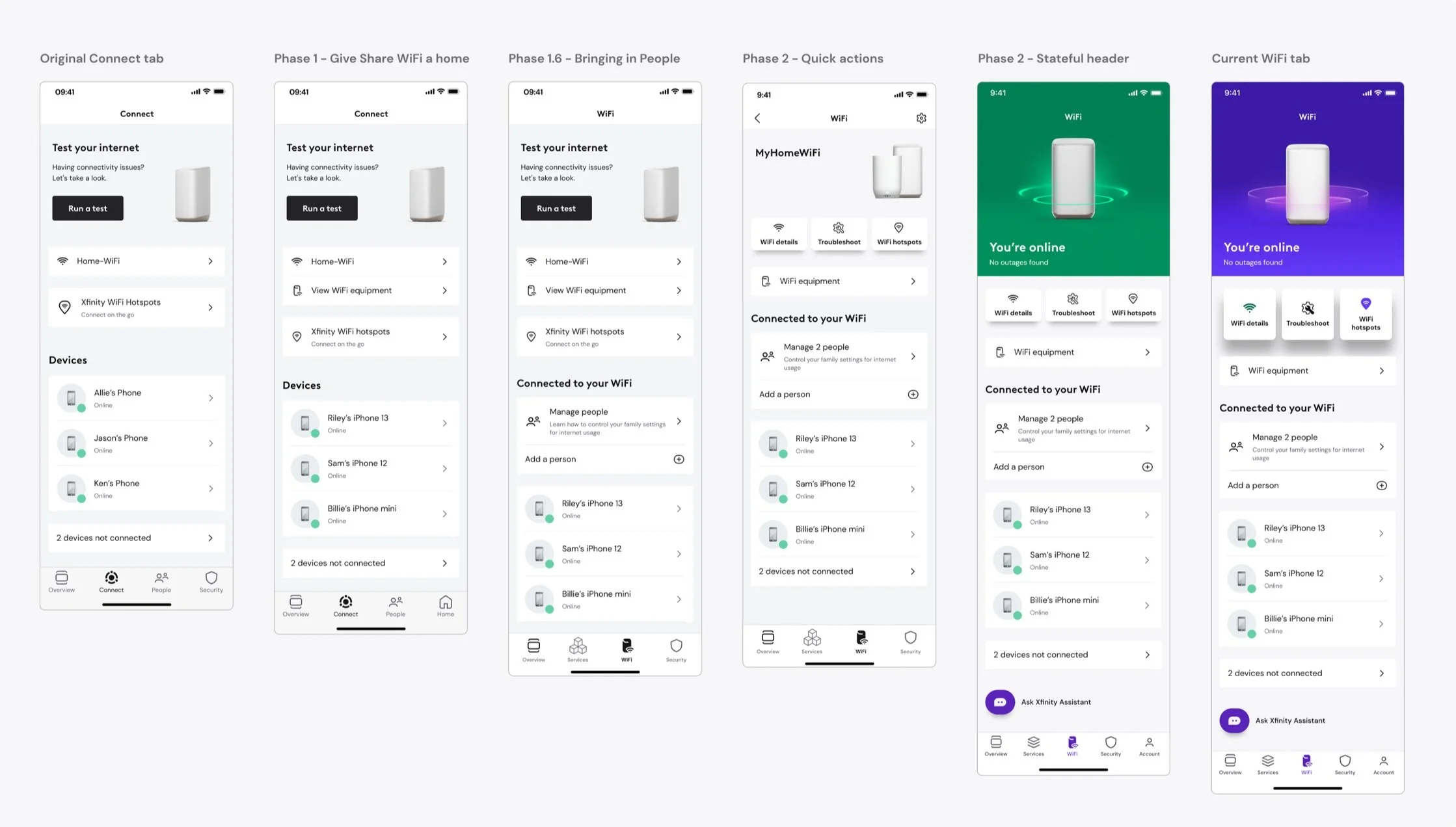
Transformation from Connect tab to WiFi tab
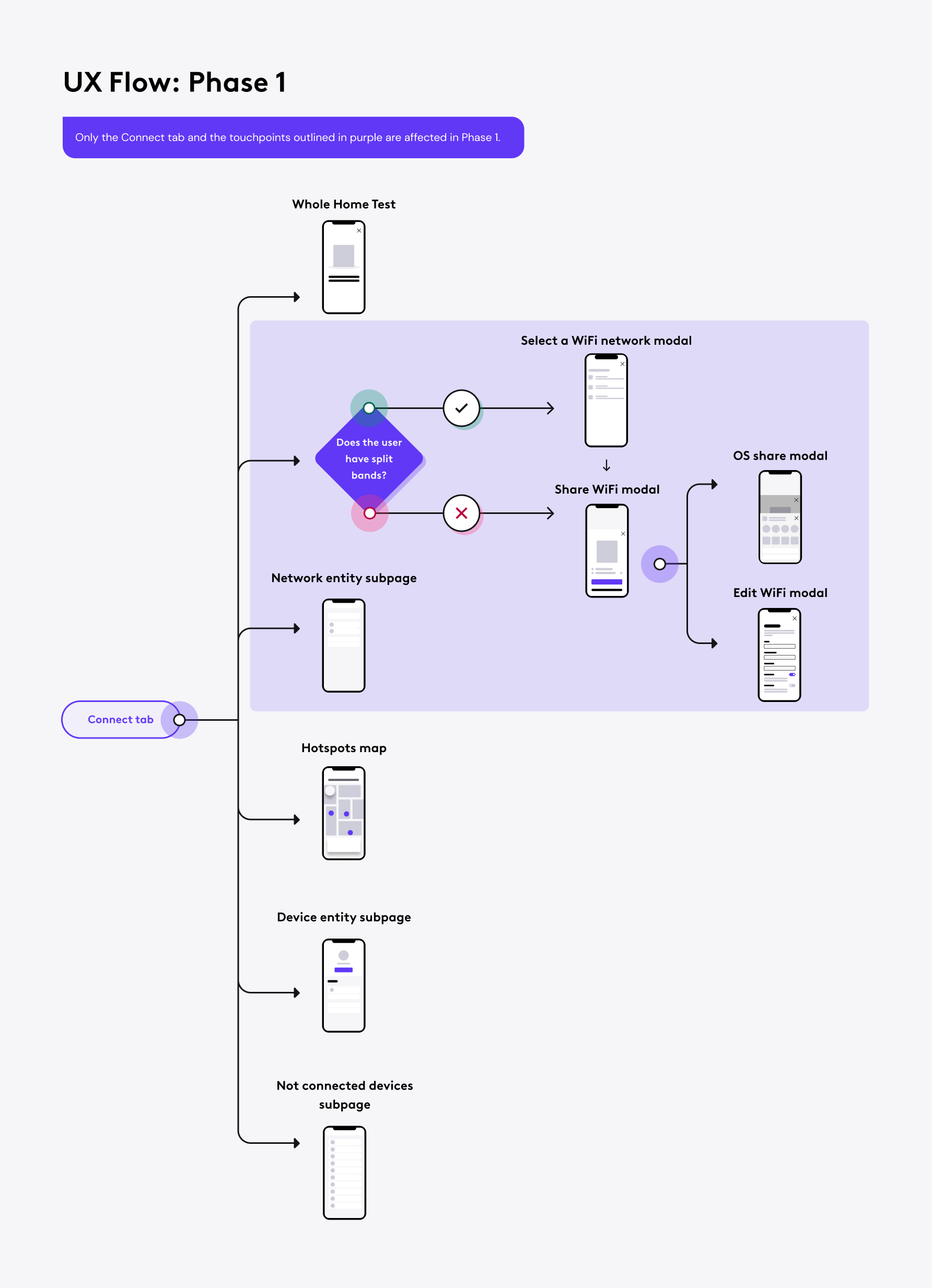
Phase 1: A home for Share WiFi
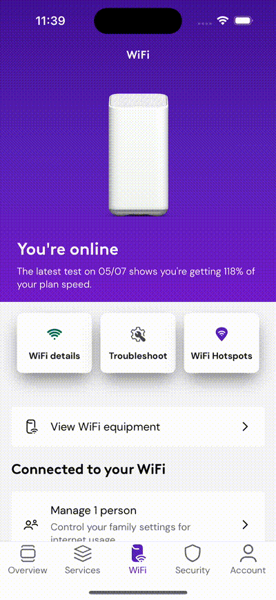
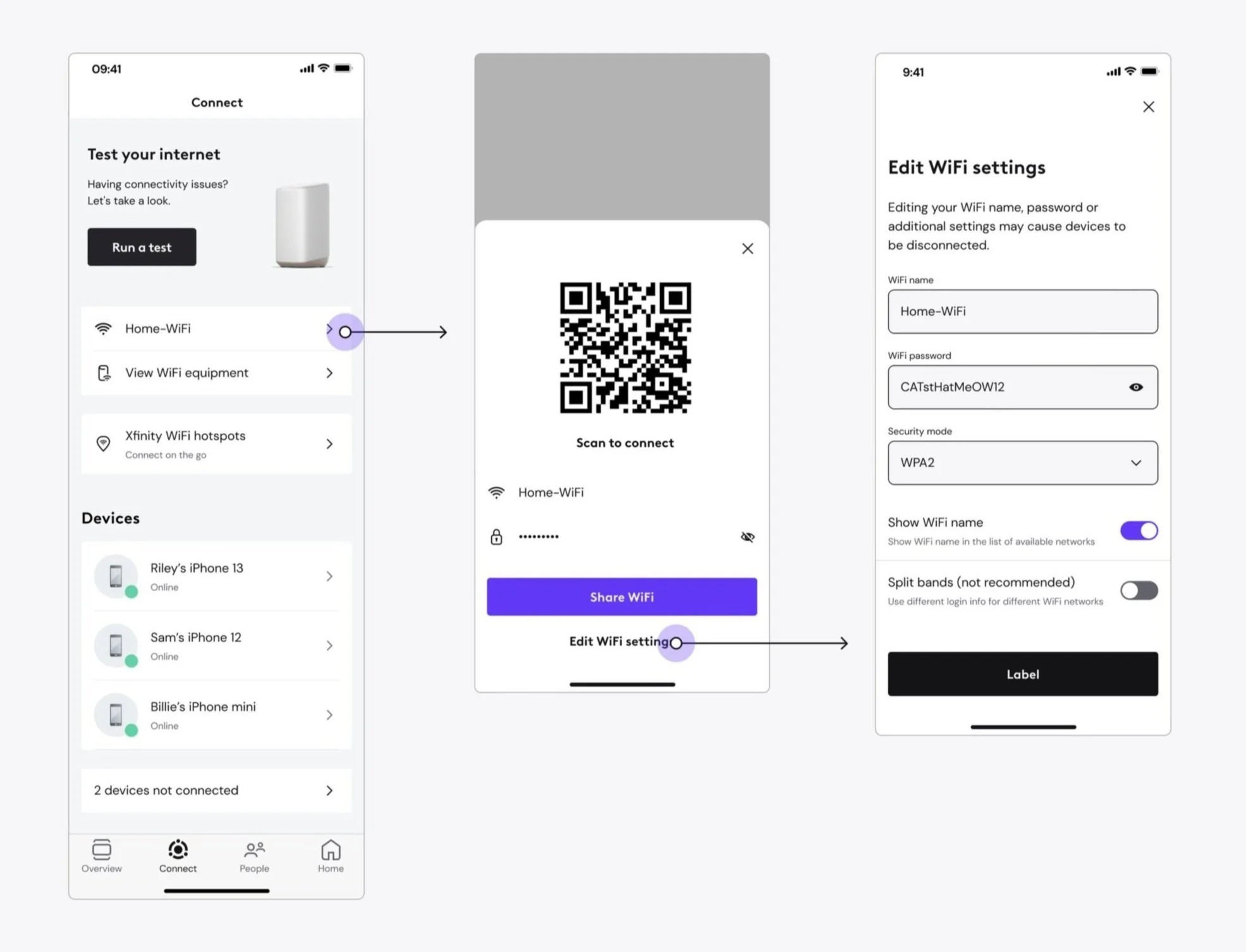
In our first phase, we are giving home to a WiFi feature that existed on the Overview in the WiFi tab where it belongs. I call this the housekeeping phase. We are also bringing forward the ability to edit WiFi settings that was buried in the experience before. Customers can now find their WiFi credentials and edit them easily in the WiFi space of the app.
We took this opportunity to update the network entity subpage as well. This phase served as a housekeeping phase to set up the tab for success as we continued to make further updates to the page architecture.
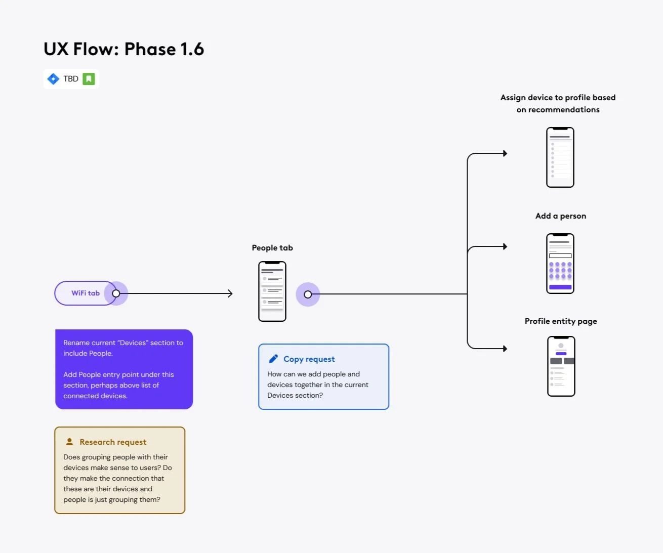

Phase 1.6: Bringing in People
People used to be a tab in the Xfinity app. Since People is essentially a group of devices and is used for organization and controlling bulk devices, we brought it into the WiFi tab.
We also renamed the Connect tab into the WiFi tab in this phase.
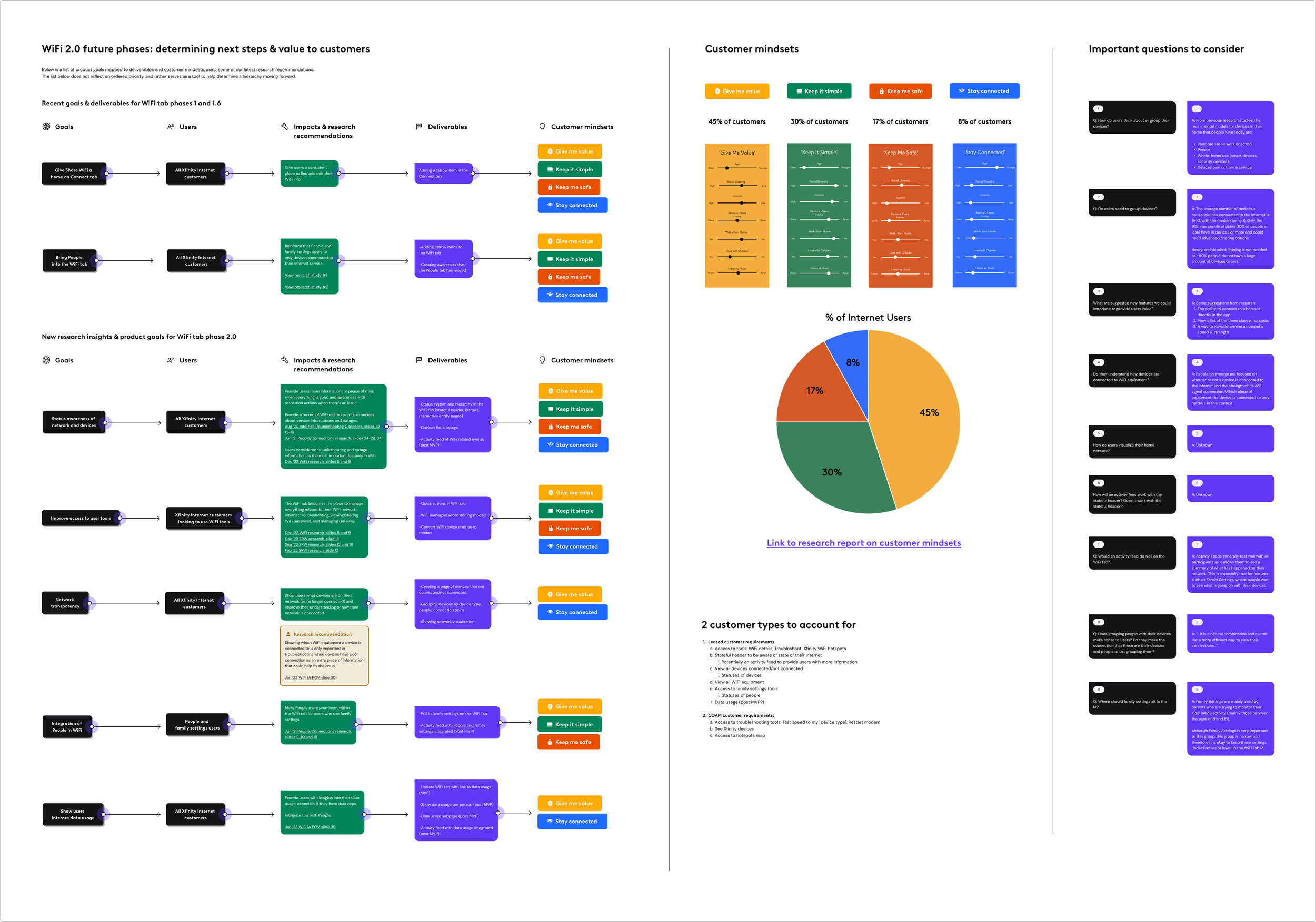
Phase 2: Prioritizing user needs
Phase 2.1: Quick actions
Leveraging recent findings from our research team, we want to elevate the tasks that users come to this tab to do, which are to see their network status, troubleshoot, and to view devices connected to their home network. We want to improves access to these tools users are looking by working incrementally to update the hierarchy of this page.
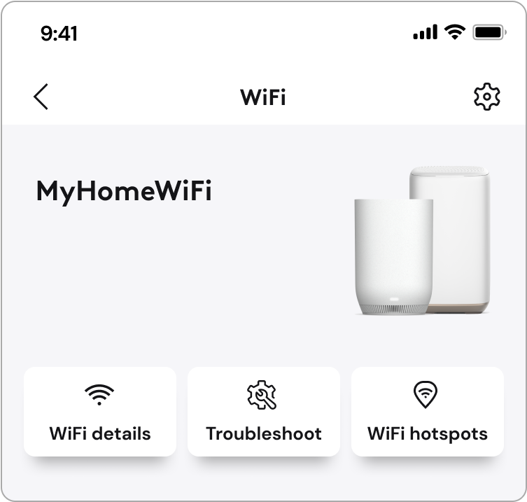
Here are the 3 quick actions:
1. WiFi details
2. Troubleshoot
3. Xfinity WiFi hotspots
The launch of quick actions and the troubleshooting modal resulted in a sustained growth of Troubleshooting modal engagement sessions, starting at 112,000 session per week and consistently averaging 300,000 sessions per week.
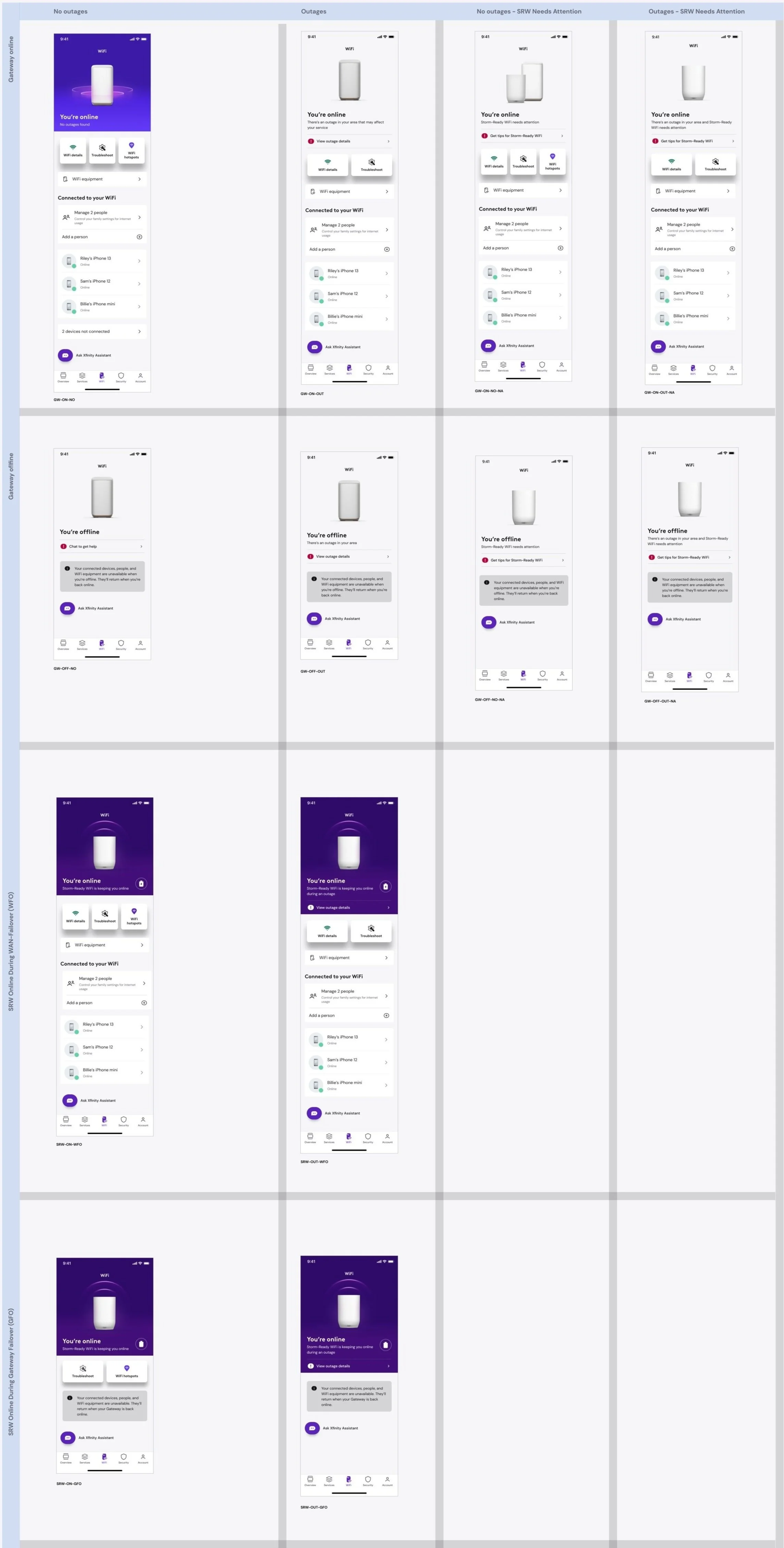
Phase 2.2+: Statefulness
As the Xfinity app is evolving to be the one-stop shop for all things related to our customers’ services, we want to sunset the stateful header in the Overview that has traditionally communicated the state of the users’ Internet and digital security status. Therefore, we need to communicate the status of our customers’ network elsewhere in the app—the WiFi tab.
We made the header flexible so that it can handle any state we throw at it.
As our engineers work hard to build in status onto the WiFi tab in the backend, we will phase out our delivery of stateful headers. From phases 2.2 onwards, I phased out all the states that customers can see.
We are currently continuously updating the WiFi tab based on user needs. We updated our color story for each state and started using our brand color. We are adding motion to the Gateway in the A-spot and considering interactivity.
Tap on the chart to the left to see the full chart of states